
Website experience also known as User Experience (UX) & User Interface (UI) is all about how a user feels while interacting with a website in terms of its design, usability, accessibility, and responsiveness. At its core, usability is all about ensuring site visitors can find their way to and through the site, find what they are looking for, and achieve their goals quickly and effortlessly. UI UX Design has become an essential value that contains user satisfaction and involvement and depends on factors that impact Search Engine Optimization (SEO). Optimizing content and the content delivery system can help to rank better and attract more visitors and customers.

What Is User Experience (UX)?
User experience or UI UX Design is the collective experience that a user goes through while using a website or while being on a specific web page. It covers various features such as the site’s navigability, the usability and searchability of the information provided, visual design, and most importantly, the satisfaction level associated with using the site. What makes UX good is that the users can attain their desired goals, products, or information without a lot of hassle hence making subsequent visits more likely.
What Are The Types Of User Experience?
UI UX Design is a combination of many factors that define how the user would feel and perform concerning a given website. Details of these types can be useful in the design of a more successful and satisfying user experience. Below are the main categories of user experience.
Information
Information UI UX Design is concerned with the organization and presentation of content to the user of the website. This is in the areas of information organization, comprehensiveness, and simplicity. Information UX makes sure that users have access to the content that they seek without a lot of difficulty or confusion.
Interaction
Interaction UI UX Design refers to the experience that users get while using the website. This involves the interactions of different elements such as buttons, links, forms, and other related elements. A positive interaction UX makes it possible for the user to go through the site without hitches and achieve the intended steps.
Visual Design
Visual design UX relates to the general appearance of the website. It includes the positioning of images and textual content, choice of colours, typeface, style, and other graphic and aesthetic features. This is important since a well-designed visual UI UX Design not only makes it aesthetically appealing to the eyes but also supports good UX by directing users to elements of interest.
Why does UI UX Design matter to SEO??
UX is designing the interface well, or making the website attractive – it also impacts much of the SEO. The benefits of a good UX include increased chances of ranking high on the search engine results page and being more noticeable. This will explain how UX Affects In SEO and why it is important.

Explanation of how UI UX Design impacts search engine rankings
Google and other search engines rank sites that are most user-friendly on top of the search results. Some of the key aspects of UI UX Design include the speed at which a web page loads, the level of responsiveness to mobile devices, and the level of user engagement. This is because when a website provides a good experience, users will therefore spend much time on the website, be more active, and possibly revisit the website in the future. Such activities indicate to the search engines that the website is valuable and could be relevant for ranking high on the search engine results.
Importance of user signals in determining search engine rankings
These are the behaviours that give an indication of the quality of experience a user has when using a certain website. Here’s how UI UX Design impacts SEO and why it matters.
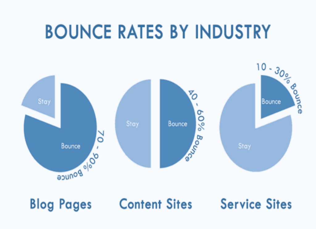
Bounce Rate
The portion of the visitors who access only one page of the site before exiting. If the bounce rate is high, this may point to a weak UX.
Average Session Duration
The total time spent by the users on the site during their visit The total number of times users visit the site per day. Longer sessions imply that the users are interested in the content and use it as a source of information.
Click-Through Rate (CTR)
The number of people actively interacting with the search result is divided by the number of people who even see the result. Higher CTRs can be attributed to the fact that the content posted is interesting and related to the search term.
Mobile Responsiveness
In the current world where websites and applications form part of everyday life, mobile phone optimization is part and parcel of user experience and impacts search engine results. A mobile-first site optimizes its layout and content for viewing across different mobile devices without compromising on the quality of the display.

Significance of mobile-friendly websites in the era of mobile browsing
This has made it mandatory for any organization to ensure that they have websites that can easily fit into the screens of mobile devices. undefined
Prevalence of Mobile Users
A considerable number of Internet users visit websites through mobile devices such as smartphones or tablets. This means if a website is not mobile-friendly, then it is potentially losing out on a considerable market share.
Google’s Mobile-First Indexing
Google initially indexes and ranks the mobile version of a site and not the desktop one. Those websites that are not mobile friendly may even be ranked low by the search engine.
User Expectations
In today’s world, customers demand fast loading of the site and proper performance on different mobile platforms. If a consumer gets a negative experience on the mobile site or app it results in a high bounce rate and vice versa.
Tips for optimizing websites for mobile users
To ensure your website is mobile-responsive and provides a great user experience, consider the following tips
Responsive Design
Use a responsive design approach that enables a website to effectively align to the various mobile devices. Employ flexible grids for the layouts, and use fluid images with CSS media queries that can adapt to the site’s context.
Fast Load Times
You should ensure that the speed of your website is optimal, but even more so for mobile platforms. Optimize images, implement browser caching, and minimize the use of HTTP requests to reduce the amount of time taken to load the page.
Touch-Friendly Elements
Two; Make buttons and other elements that pop out for interaction on the small touchscreens big enough. Make sure that buttons are big enough and spaced effectively so that people do not activate them by mistake.
Simplified Navigation
Limit navigation menus and place them within easy sight and reach when in use with a mobile device. Mobile navigation is often based on the so-called collapsible or “hamburger” menus to reduce its size and increase its usefulness.
Readability
Make sure that when placed on small screens the text is still easily readable by using quite fonts and proper font sizes. Long blocks of text should be prevented and material should be separated by using subheadings and point-form headings.
Test on Multiple Devices
It is also very important to ensure that your website is responsive to mobile devices and different resolutions and check for any problems that may be occurring. Some of the widgets you can use include the Google Mobile-Friendly Test which can help you assess the mobile-friendliness of your site.
Navigability and Site Structure
The concepts of navigability and site structure remain core facets of UI UX Design that can greatly influence how users engage with your website. The well-developed site structure and easy-to-follow navigation leave no doubt the user will be able to locate the content he/she is looking for within no time. This, in turn, results in increased user satisfiability and has a favorable impact on search engine ranking or SEO.
Importance of clear navigation and organized site structure for users
Clear navigation and a logical site structure are crucial for several reasons.
User Satisfaction
Since users get to the exact location on your site they are demanding, the satisfaction they will gain is heightened. This minimizes the level of disappointment and rids the chances of the client not coming back.
Lower Bounce Rates
A well-arranged site format means that customers are not easily lost and hence have low chances of bouncing off the site. Lower bounce rates tell the search engine that your website comes as valuable and relevant to the viewers.
Improved Indexing
Structures of sites work for search engines as teaching aids or templates to determine the importance of particular content. Information architecture is the best practice for where a site should go and how it should arrange data so the search engines can crawl it efficiently, which increases your site’s ranking.
Enhanced Discoverability
Well-structured content along with a proper syntactic link allows the user to view more pages on your site and to spend more time there.
Tips for Optimizing Websites for Mobile Users
To ensure your website is mobile-responsive and provides a great user experience, consider the following tips.
Responsive Design
It applies basic practices for the layout of a website across various devices covering a broad range of screen resolutions. Flexible grid layouts, floating images, and CSS media queries are the best practices for providing relevant design across devices.
Fast Load Times
Ensure that the site loads faster for mobile users as well since many users browse the internet on their mobile devices. Optimize images, use caching in the browser and manage HTTP requests to enhance the page loading speed.
Touch-Friendly Elements
Make text labels of buttons as well as any other components of the UI convincing and clear for touch on a small display. The buttons must be large and should also have adequate space between them so that people do not click on the wrong link.
Simplified Navigation
Parts of the site where navigation menus are placed should be kept simple and must load quickly even on smartphone screens. One should use the collapsible menus, also called the “hamburger” menus, which provide users with more space, as well as functions.
Readability
This should be especially the case on screens that are smaller in size to ensure that the text available and the fonts used, as well as the font size can be easily read. Do not write long paragraphs and utilize this technique of the structuring of content with the help of headings and bullet points.
Test on Multiple Devices
You must be testing your website on various mobile devices and screen sizes at certain intervals of time to know the problem area. Reader-friendly mobile-checking tools such as Google Mobile Friendly Test can also be used.
Google Page Experience (UX) Update
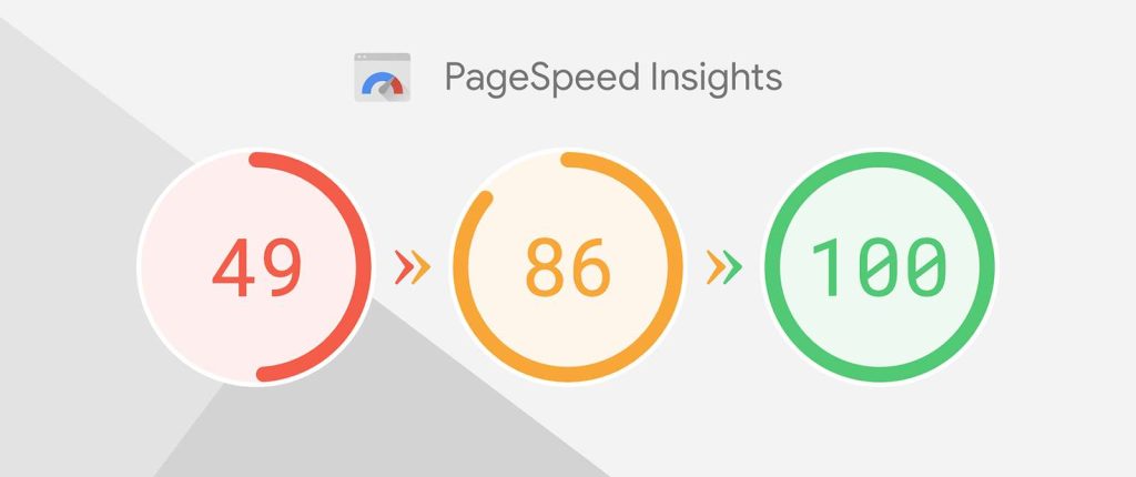
Google’s recent Page Experience update sees the algorithm integrating several measures of UX, highlighting the significance of the subject. This update also includes Core Web Vitals, which are metrics related to page loading performance, interactivity, and visual stability. Hence, the websites that perform well on these parameters will be able to rank better on the searches.
Conclusion
It is clear that user experience is not a decoration or a trend – it is one of the main pillars of website success, for both customers and search engines. By emphasizing some criteria such as the informational aspect, interaction, graphic design, mobility, and accessibility, one can construct a website that will be appreciated by users and search engines. In the future, with the constant development of the digital environment, improving the UX approach will remain one of the main factors for maintaining high rankings in search engines.